Sharp Little Bones
CD, vinyl and digital booklet design / layout
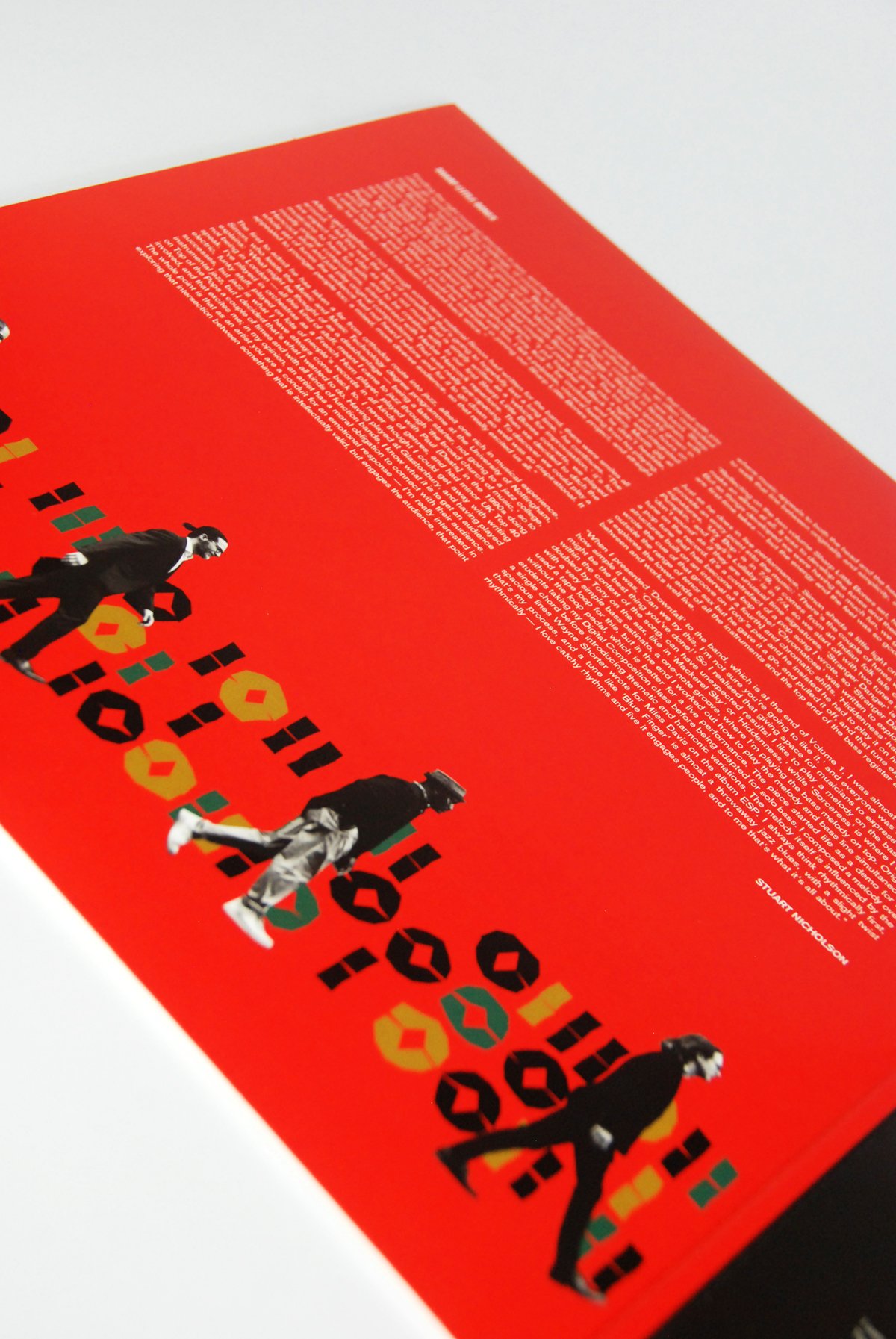
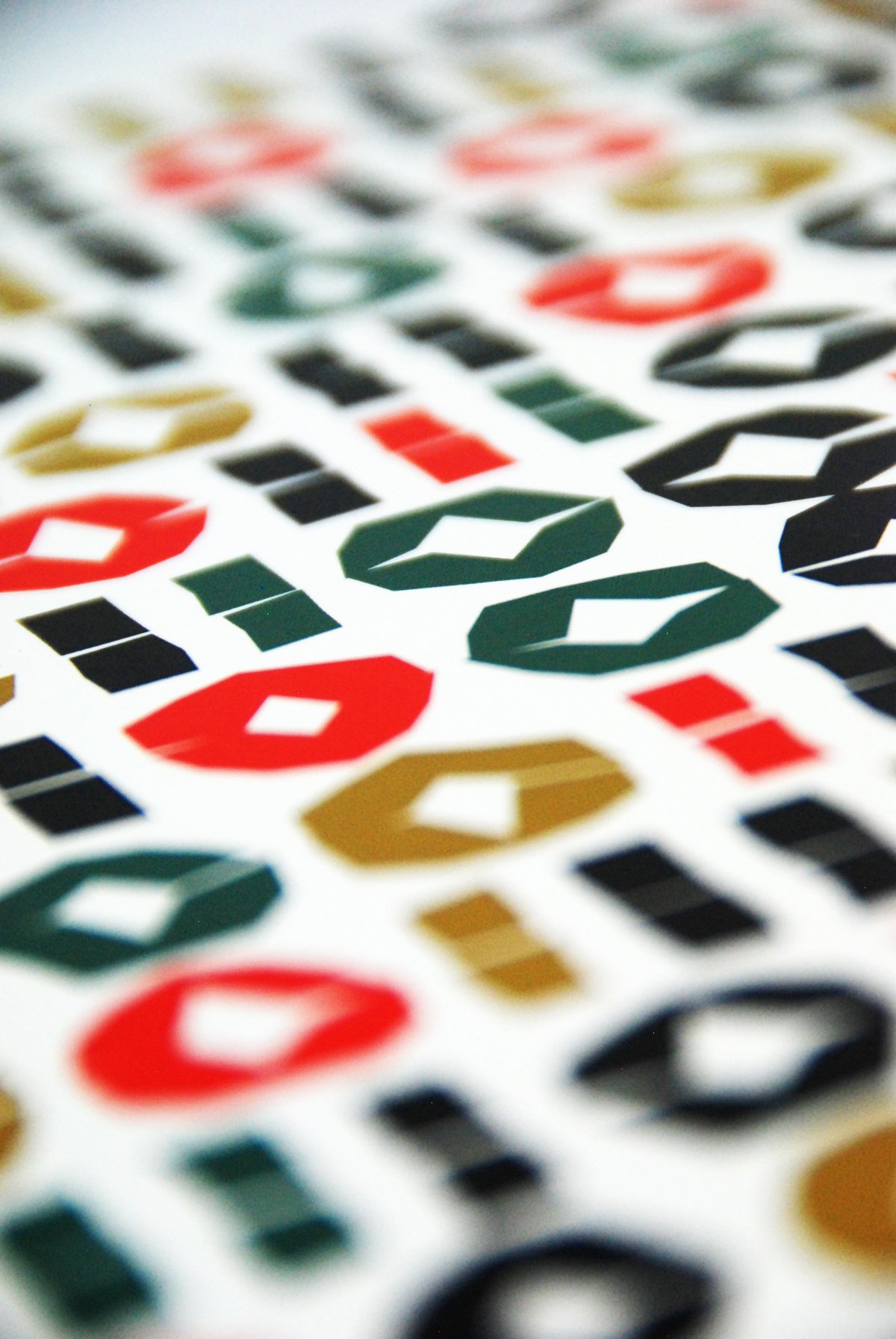
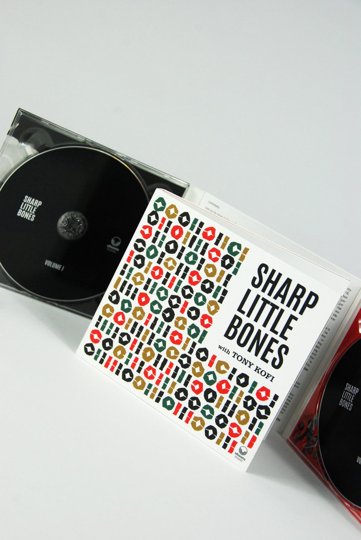
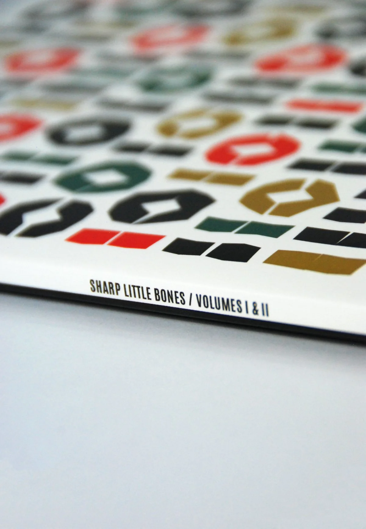
I received an email from Simon Paterson, a composer, educator and bass luminary, asking if I could produce artwork for the eponymous debut double album of his jazz group, Sharp Little Bones. It needed to go to print in a fortnight. Simon wanted the artwork to convey an ‘energy’ (surface but also spiritual). It should be contemporary yet with a nod to classic ‘modern’ jazz and the atmospheres of Reid Miles/Francis Wolff’s Blue Note cover art. It needed to work as a thumbnail on the record label’s website and also hold true as a twelve inch sleeve design. Martin Makowski had taken some great photos to weave into the layouts. I asked Simon where the name ‘Sharp Little Bones’ came from. He said that he had spotted these words in an article reviewing a Steely Dan concert and the phrase appealed because he ‘wanted to hint at what lies beneath the surface of something otherwise ostensibly smooth’. For the main cover imagery I pinned a selection of crude unique shapes into an overall uniformity. They have a slight ‘vertebrae’ feel, enough to resonate with the title. I was thinking of them as a kind of fizzing notation where the details make the whole.


